Morel speaker company website
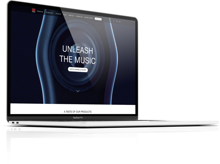
Building an image and sales website for the prestigious speaker company – Morel.
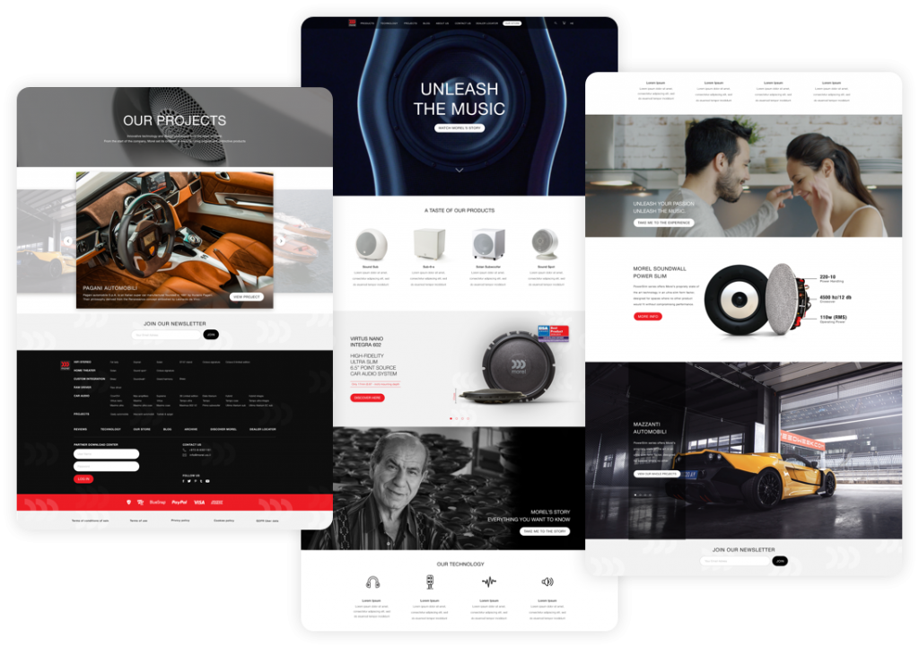
The client came with a desire to modernize the old website, both technologically and design-wise. For this purpose, we created a new language that matches the brand and, in the process, we simplified the purchase funnel and made the product more directly accessible to the user. In the new design for the site we emphasized clean lines, where the design language was characterized by the colors of red, black and white.
The main purpose of the site is to leave an impression on the user, in accordance with the products they sell and in accordance with the target audience of the brand.
The technological challenge
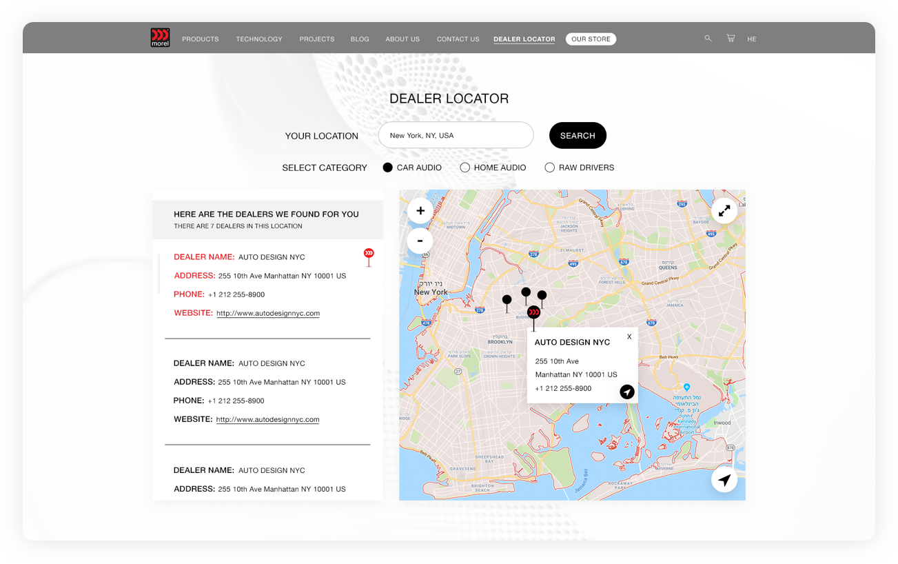
- Morel's speakers are divided into many categories and subcategories, therefore there is a need for a clear division.
- Not every product is sold directly on the site and the challenge was to make it accessible and convey the message clearly.
- On a site that aims both at sales and at creating an image, a clear hierarchical characterization is necessary.
- The site needs to convey technological prestige as well and therefore a lot of effort was invested in thinking about the behavior of different screens.

user experiences
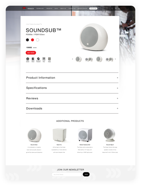
As a luxury speaker company, the brand has many types of speakers, with each serving a different purpose, so we wanted to bring this to light in the process of purchasing the product.
We have rebuilt and simplified their purchase funnel to improve the user experience, enabling them to quickly and easily find the product(s) and/or information they seek and making them feel more comfortable in each step of the process towards purchase.

