Insurance comparison site
Comparing prices online can be a long and sometimes confusing process. On the Choosy website, you simply fill in your personal details and your insurance needs and the site will provide the users with a list of the most suitable results.
As the name of the site indicates, the user only has to choose from the pool of insurance offers they receive.
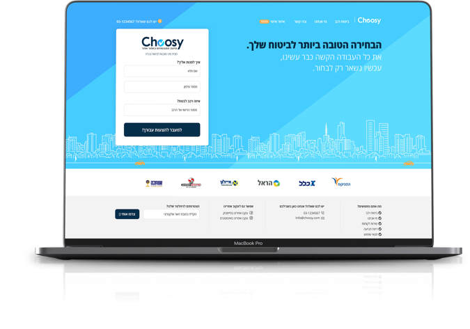
Comparing insurance prices quickly and conveniently
In designing the website, the emphasis was on creating clean and clear language that would help the user achieve the best results. We chose shades of blue and used these shades throughout the site to lead the users to the choices that best suit their needs and personal situation.
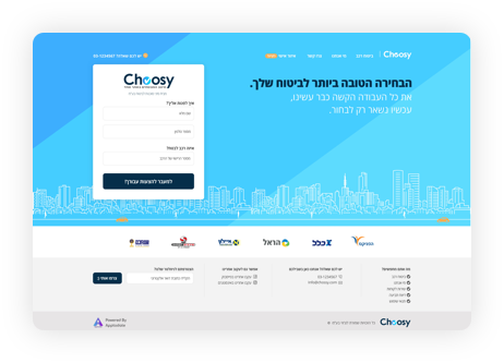
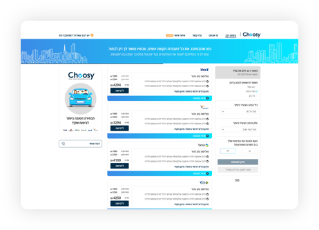
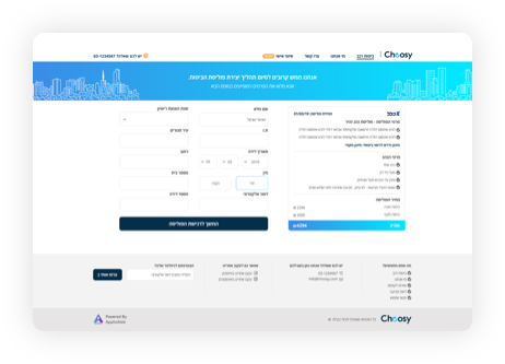
Combining content with figurative language to make the information accessible
In combination with the shades of blue, we have added a language of illustrations that accompany the user and help them to understand and visualize the content.


The technological challenge
- Using a smart algorithm, the site interfaces with the various insurance companies and receives from them prices that are customized for each user.
- Creating differentiation for the customer.
- Building a process that leads to receiving several inquiries.
